
- 400-6265-600
- 028-8533-3934
info@silksoftware.com

400-6265-600


技术连接世界
数字成就未来
数字成就未来
致力于为品牌提供专业电商解决方案
实现企业数字化转型
实现企业数字化转型


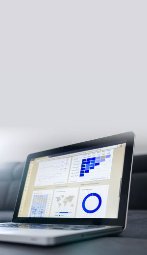
服务与支持
从电商战略到用户体验,从平台实施到系统集成,再到数字营销等服务,
全程地建立与拓展电商业务,构建可持续的商业价值
全程地建立与拓展电商业务,构建可持续的商业价值


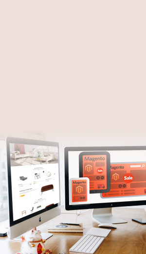


产品与方案
16年以来的电商行业经验、技术积累与全球化数字视野,
从品牌战略、技术支持,到未来无限的可能与创造性,我们都替您想到了
从品牌战略、技术支持,到未来无限的可能与创造性,我们都替您想到了
品牌客户
服务于世界五百强客户,十余个行业领域,为国内、国际以及跨境出海领先品牌企业提供电子商务解决方案。
品牌客户
服务于世界五百强客户,十余个行业领域,为国内、国际以及跨境出海领先品牌企业提供电子商务解决方案。
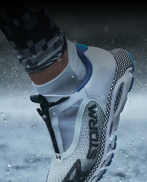
运动品牌
B2C/服装行业
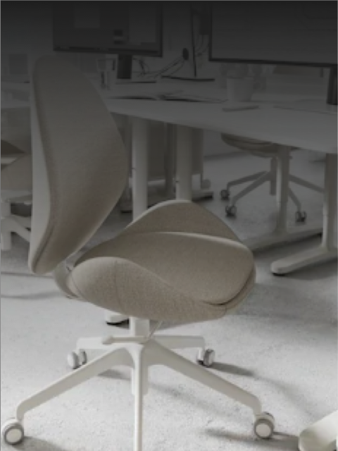
家居品牌
B2C/家居行业


医疗品牌
B2B/医疗行业


科技品牌
B2C/智能科技
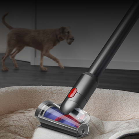

家电品牌
B2C/家电行业


马上开始您的商业探索之旅
400-6265-600 028-8533-3934
版权所有©2012-2024思而科软件有限公司
 蜀ICP备09001333号-1 | 隐私政策